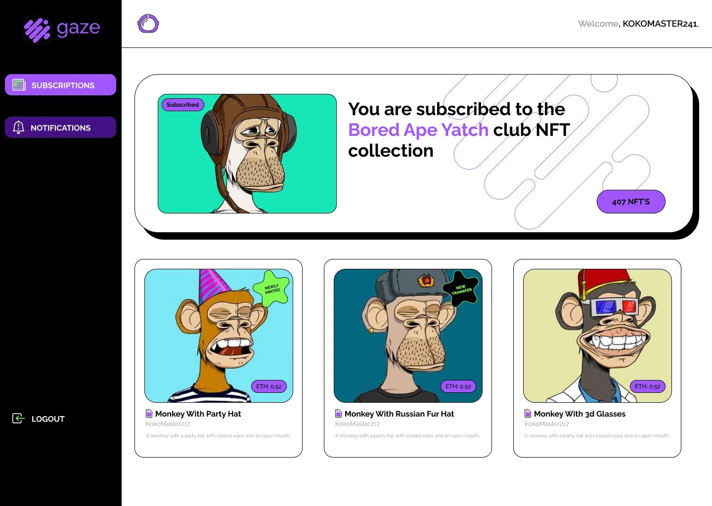
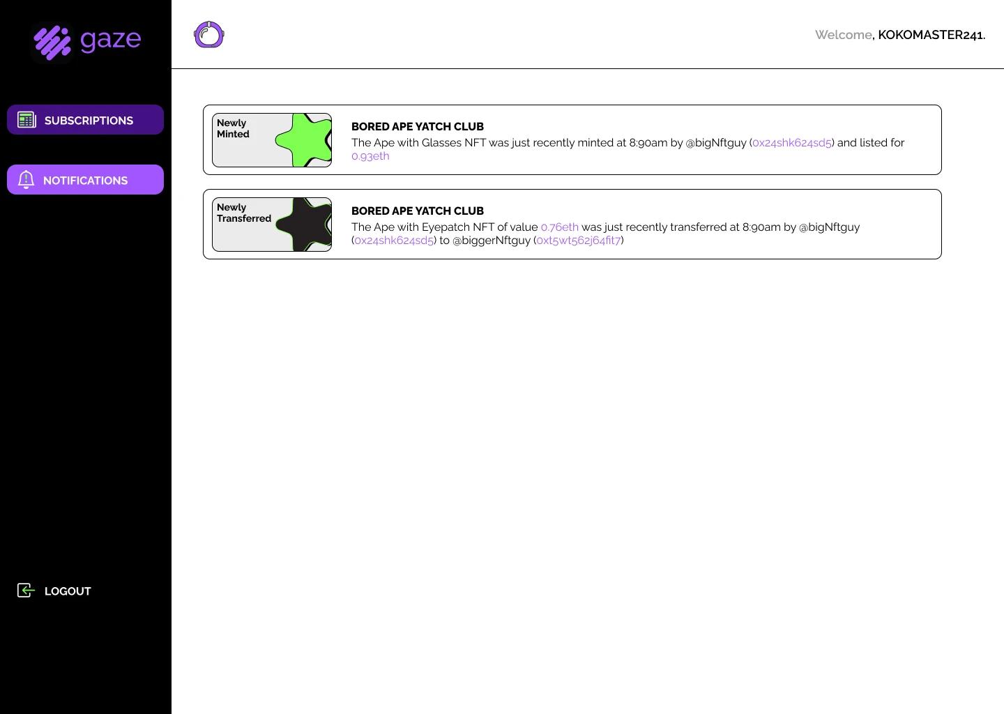
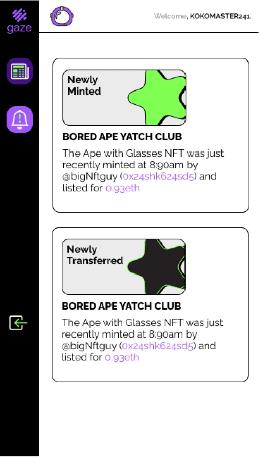
An Ethereum based NFT service project that serves notifications to users from activity on the NFT Collections that they are subscribed to on the app. A collaborative effort with @Bumni
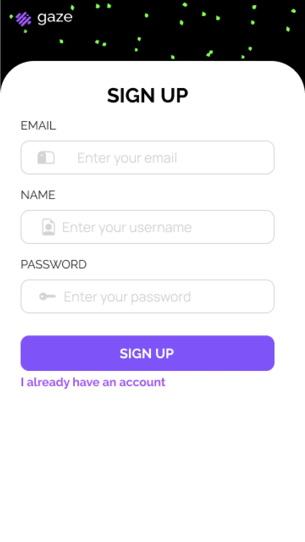
I worked on frontend development on this project as well it's UI/UX designs. This was my first experience with UI/UX design and presenting the visual identity of a product. The experience helped to refine my frontend development as it gave me insight and an eagle's eye view on how the product would eventually turn out. On the frontend side, I delivered the app working with several apis, including jwt apis for authentication to deliver unique experiences and data to each of our users. I also focused on quick development, working with tailwind and approaching the app with modularity in mind, working with and reusing components.

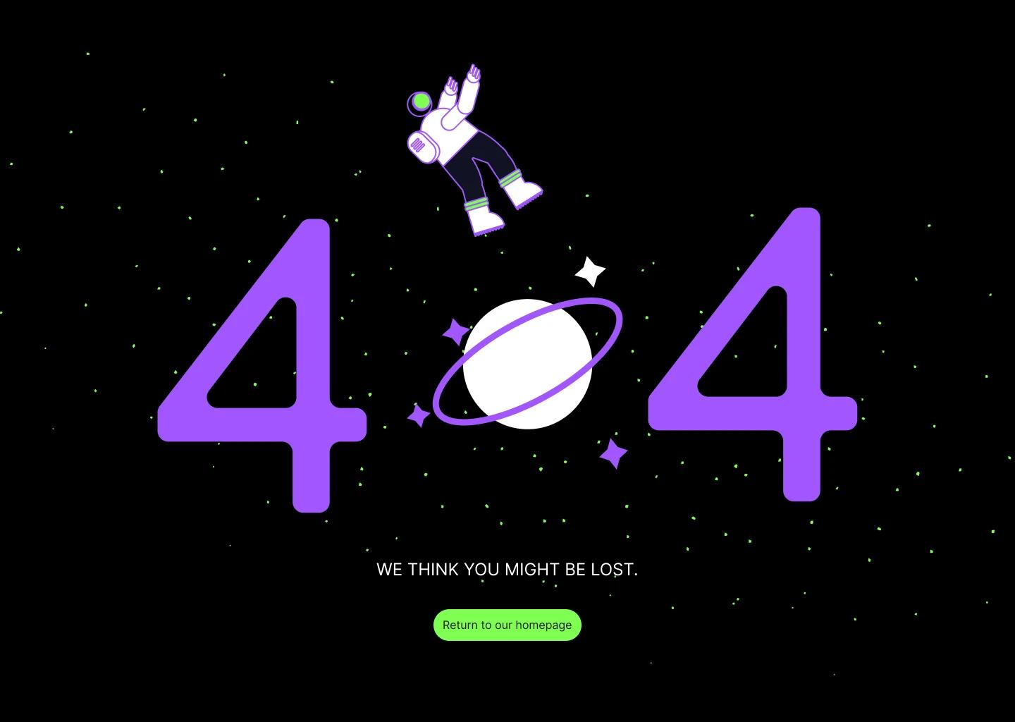
A primary focus was to invoke a sense of a vibrance and excitement that we wanted users to associate with the notifications. It influenced the choice of color and the style of the illustrations, an animated brutalized style. I work on illustrations, UI/UX and the frontend, my collaborator @Bumni worked on the backend and frontend
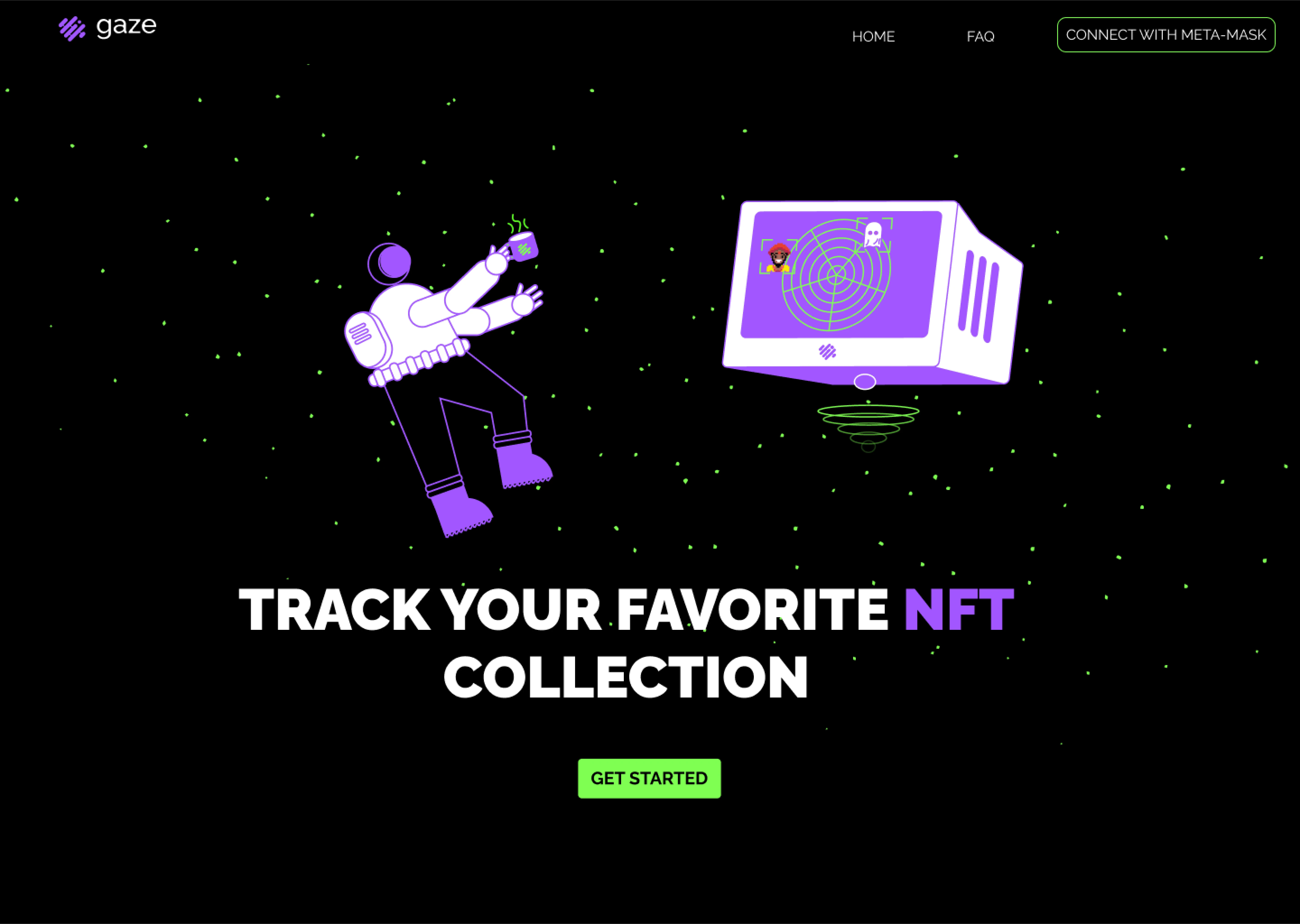
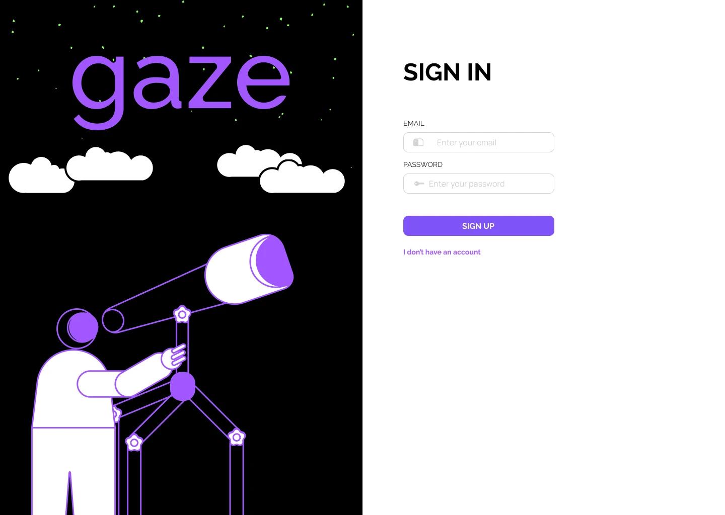
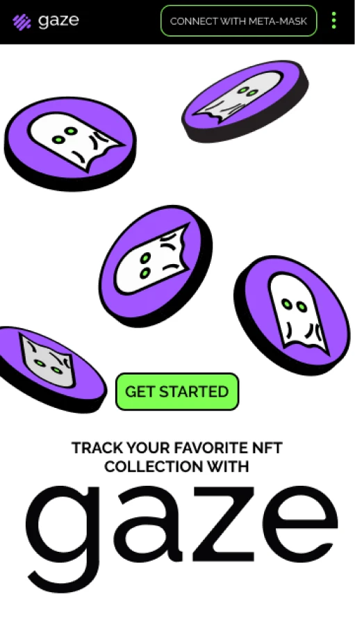
The app is a NFT notification service. I brainstormed a couple of ideas until i landed on something i though encapsulated what it offered. In a sense, it served as a way to keep up to date and navigate through the occasionally murky waters of NFTs. From there, the idea of space emerged as well as the various space themed designs and finally the mascot, a navigating astronaut.